
Nathalie Komar was at a turning point in her life. She was starting her own corporate communications business and at the same time, becoming more serious about her passion for food and developing side projects based on that passion. She initially approached me about creating a logo for her communications business and through the process of creating one identity, we also spun it out into a second one.
Komar Communications provides consultancy to companies in transformation projects focusing on managers and employee communications. There were a few challenges in coming up with this identity. For one, even though she would be working in a corporate setting, Nathalie wanted the logo to seem friendly and approachable and to reflect her as a person. Another challenging aspect was that Nathalie was setting up a Netherlands-based company, but with international customers. How were we to communicated all of that visually? Nathalie’s culture is Peranakan; descendants of Chinese immigrants who settled in Sinapore, Indonesia, Malaysia and Thailand. My favorite part of any project is the research, and Nathalie sent me visual examples of Peranakan culture to get me started.
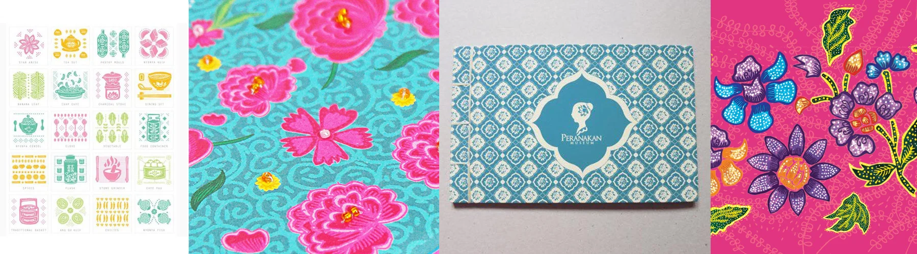
Some examples of Peranakan design.
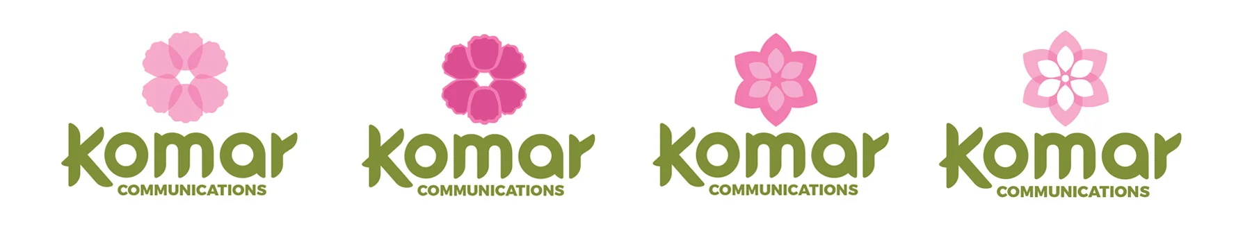
One of the consistent elements of Peranakan design is the floral pattern. I noticed a lot of beautiful curves and lack of any hard angles. When developing the typography for Komar Communications, I wasn’t able to find a font that completely evoked Peranakan style, so I decided to create some custom typography. The word mark I came up with has no sharp corners anywhere - everything is a continuous curve. The ends of the letters resemble flower petals.
Komar Custom typography.
After the custom type was given the go ahead, the next step was to start integrating it. We decided on a flower motif, to echo Peranakan tiles. A number of iterations of the flower were tried, as well as color combinations, mostly focusing on green/aqua and pink/purple.
At this point in the process, there was something that wasn’t working and Nathalie couldn’t quite put her finger on it. She took some time to think about it and when she came back she admitted that her head had been in the food space, as that was her biggest passion outside of work. She had been working on a food blog on Instagram, with plans to develop other food-based projects. Most of what we had developed up to this point felt perfect for food but we hadn’t quite captured the right visual for corporate communications yet.
At this point, the project split into two, as she encouraged me to take what we had and develop it into a new brand that she was forming, Komar Eats, and to maintain some visual consistency between the two as we continued to develop the corporate communications logo.
The food logo came easily. Nathalie told me that she liked the image of a bowl of noodles to represent her Asian heritage. Using the custom typography and some of her favorite color combinations from the previous logos, we narrowed it down pretty quickly.
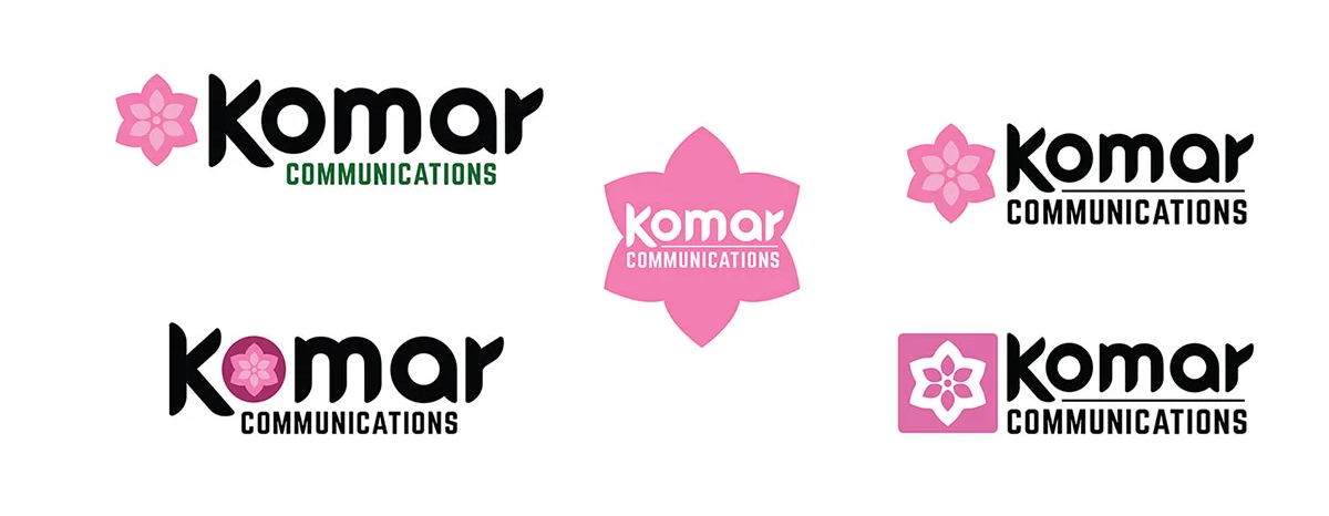
Continued exploration of the flower motif led to an eventual finalized design for Komar Communications.
We drilled down versions for both Komar Communications and Komar Eats at almost the same time. What had started as one brand identity had evolved into two different ones. In concept, the two identities were about as far apart as they could be, but we managed to make them both essentially Nathalie by keeping the typography and colors consistent.